Talk first, edit directly when it helps
After this, you'll be able to picture how the Claude Design screen works, choose between chat, inline comments, and direct canvas edits, and give feedback that actually moves a design forward.
Before you start
Do Access, plans, and current usage first; once you can get in and budget your builds, this lesson hands you the one habit that makes every build count.
The idea
Claude Design has two halves: you talk on the left, the design lives on the right, and you now have three steering moves. Use chat for broad changes, inline comments for a specific element, and direct canvas edits for quick layout or text fixes. The people who struggle are usually using the wrong move for the job.
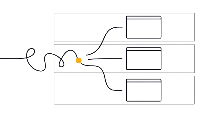
There are no layers to fight here. There is a conversation, a page that responds to it, and a canvas you can now edit directly when precision helps.
When you send your first prompt, Claude usually does something a normal design app never would: it asks you a few quick questions first, like how long, what tone, who is this for. (If your first description was very detailed, it may skip the questions and build right away. That is fine too.) Those questions are not the tool being slow. They are the tool refusing to guess, so the first render lands close instead of generic. Answer them like you would brief a smart new colleague, and the first result is much better.
Here is the before and after: A frustrated user sees a cluttered hero and starts hunting for hidden layers. A fluent user says "simplify the hero to one headline, one subhead, and one button." Then, if the button is slightly off, they drag it into alignment on the canvas instead of spending another broad prompt.
The fluent user knows the order of operations. Words set the direction. Comments target one element. Direct edits handle small visible fixes.
The three steering moves are easy to separate. Use chat when the whole page structure, tone, or section order is wrong. Use an inline comment when one card, button, or image needs a local change. Use direct canvas editing when you need to drag, resize, align, or edit text without asking Claude to rethink the whole design.
Why this design choice is good news for you, the non-designer: describing what you want in clear language is a skill you already have, and direct edits now cover the obvious small fixes. Your job is to look at the result honestly, choose the right steering move, and say the next true thing about it.
Talk first for direction, comment for one element, edit directly for small layout fixes. The skill is choosing the right move before you spend another generation.
- GoalAfter this, you'll be able to picture how the Claude Design screen works, choose
- InputsThe screen is two halves: you talk on the left, the live design renders on the right
- Design Canvas ModelYou can describe the two-pane layout talk on the left, design on the right without
- ReviewYou understand that Claude usually asks clarifying questions on purpose, and you
- ProofTake one vague reaction you might have to a design 'it feels cold' and rewrite it as
Try it (10 min)
Watch out for
- Using direct canvas edits for a structural redesign. If the page order, tone, or hierarchy is wrong, use chat.
- Rushing past Claude's clarifying questions. Those questions are what make the first render good. Answer them like a real brief.
- Giving vague feedback like 'make it pop' or 'this feels off.' Name the element and the specific change so Claude can act on it.
- Spending a new generation on a tiny placement fix. If the canvas lets you drag, resize, align, or edit the text directly, use that.
Paste this into Claude
I want to practice giving Claude Design good spoken-style feedback before I'm in front of a real design, so I don't freeze up.

Here's a made-up situation: Claude Design has built me a landing page for my [YOUR_BUSINESS_TYPE]. The hero headline is too small (the hero is the big banner area across the top of the page), the colors feel too cold, the call-to-action (the main button you want people to click) is hard to find, and the testimonials are at the very bottom where nobody will see them.

Please:
1. Rewrite each of those four complaints as a clear, specific instruction I could say to Claude Design to fix it. Show me the difference between a vague version and a sharp version of each.
2. Give me a simple rule of thumb for turning "this feels off" into an instruction Claude can act on.
3. Tell me which steering move fits each fix: chat, inline comment, or direct canvas edit.
What a good response looks like
Here's your feedback practice:

**1. Vague to sharp, for a yoga-studio page:**
- Headline: vague "make it pop" → sharp "make the hero headline about 40 percent larger and bold."
- Colors: vague "warmer" → sharp "shift the palette from cool blue toward warm sand and terracotta."
- Button: vague "fix the button" → sharp "make the 'Book a class' button high-contrast and put it in the hero, not just the footer."
- Testimonials: vague "move these" → sharp "move the testimonials up to right under the hero, before the pricing."

**2. Rule of thumb:** Name the element, then name the change, then (if it matters) name why. "The [thing] should be [change] so that [goal]."

**3. Which steering move fits:** headline size and colors are chat if they change the whole style; the button is an inline comment if one button needs work; the testimonial move is chat because it changes the page structure. A tiny alignment nudge after that is a direct canvas edit.
What good looks like
- You can describe the two-pane layout (talk on the left, design on the right) without looking
- You understand that Claude usually asks clarifying questions on purpose, and you answer them like a brief
- You can turn a vague reaction ('this feels off') into a specific, sayable instruction
- You can choose chat, inline comment, or direct canvas edit based on the kind of change
When this breaks
- Breaks when you treat every change as a broad chat prompt. Small visual fixes now belong on the canvas, while direction changes belong in chat.
- Breaks when your feedback names a feeling but not a target. 'I don't like it' gives Claude nothing to change; 'the headline is too small' gives it everything.
AI can help with this
Stuck turning a feeling into an instruction? Inside Claude Design, say the feeling out loud: 'this feels cold and corporate, warm it up.' Claude translates it into specific changes and asks what you think. You don't have to know the design words.
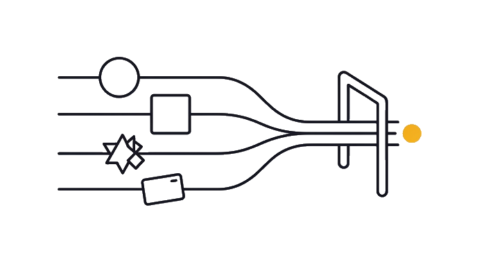
You can now
You can complete the lesson outcome in Claude Design or in the supporting tool the lesson names.
- You can describe the two-pane layout (talk on the left, design on the right) without looking.
- You understand that Claude usually asks clarifying questions on purpose, and you answer them like a brief.
- You can turn a vague reaction ('this feels off') into a specific, sayable instruction.
- You can choose chat, inline comment, or direct canvas edit based on the kind of change.
Key takeaways
Claude Design is talk-left, design-right, with direct edits for small visible fixes. You steer by choosing the right move: chat for direction, comments for one element, canvas edits for layout and text.
- The screen is two halves: you talk on the left, the live design renders on the right.
- Claude usually asks a few quick questions before building; answer them like a brief, though a very detailed prompt may skip them.
- You change broad direction with chat, local element changes with comments, and small layout or text fixes directly on the canvas.
- Good feedback names the element and the specific change ('headline too small, make it bigger'), not just a feeling.
- Describing what you want is still the main skill; direct editing now keeps tiny fixes from wasting a whole build.
Go deeper