Hero and sections that read well
After this, you'll know what a strong hero and a well-ordered set of sections look like, and you'll be able to ask Claude Design to build a page a visitor can actually follow from top to bottom.
Before you start
Complete A landing page from brand screenshots first; once your page looks like your brand, this lesson makes sure it also reads clearly from the hero down.
The idea
*A landing page works only if a stranger can read it top to bottom and instantly get it. That starts with a strong hero (the big banner area across the top) and a sensible order for the sections (the stacked blocks below it).* A page that looks pretty but reads as a jumble loses the visitor in seconds.
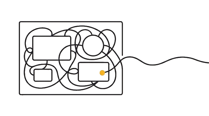
The hero is the most important real estate on the page. It is the first thing a visitor sees, and it has one job: say what you offer and why it matters, fast.
A strong hero answers three questions at a glance. What is this? Who is it for? What should I do next? A clear headline, a one-line supporting sentence, and a single obvious call-to-action (the main button you want people to click) cover all three. When a hero tries to say everything, it says nothing.
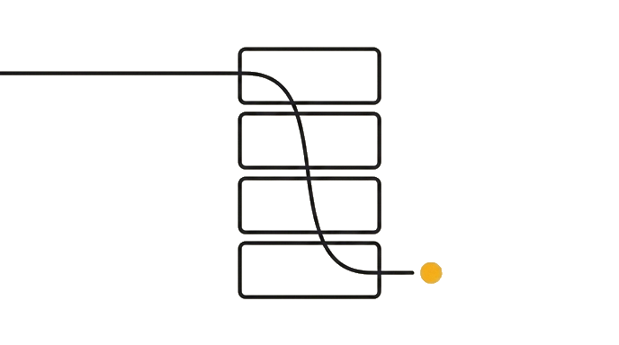
A sensible section order follows how a stranger actually decides. Hook them in the hero. Name the problem they feel. Show your solution. Prove it with examples or testimonials. Handle the obvious objection. Then ask for the action. That order mirrors a real conversation, so the page feels like it is answering questions in the order the visitor thinks of them.
Here is the before and after: Someone asks for "a landing page with all my info" and gets a wall of equally loud sections in a random order, so visitors bounce. Someone else asks for "a page that opens with a clear hero, then problem, solution, proof, and a sign-up at the end," and gets a page a stranger can follow without effort.
How to ask for this is to name the flow, not leave it to chance. Tell Claude the order you want and what each section is for. "Hero with one clear message and one button, then the problem, then how we solve it, then testimonials, then pricing, then a sign-up." You are handing Claude the reading path, so the page guides the eye instead of scattering it.
Why order beats decoration here is that a beautiful page nobody can follow still fails. Reading flow is the difference between a visitor who gets it and one who leaves confused. Polish matters, but the order is what makes the page actually work.
Lead with a hero that says what, who, and what-next in one glance, then order your sections like a conversation. A page that reads well beats a page that only looks good.
Try it (10 min)
Watch out for
- Cramming several messages into the hero. It has one job: say what, who, and what-next at a glance. Extra messages bury the main one.
- Asking for 'all my info on a page' with no order. Name the section flow, or Claude has to guess and the page reads as a jumble.
- Giving every section the same visual weight. The hero and the call-to-action should stand out; if everything shouts, nothing lands.
- Polishing colors before the reading flow is right. A beautiful page a stranger can't follow still fails; fix the order first.
Paste this into Claude
I want my landing page to read cleanly from top to bottom, starting with a strong hero, so a stranger gets it in seconds. Help me plan the flow before I ask Claude Design to build it.

My page is for: [DESCRIBE THE GOAL AND AUDIENCE, e.g. "getting small business owners to book a free bookkeeping consult"].

Please:
1. Write me a hero that answers three things at a glance: what this is, who it's for, and what to do next (a headline, a one-line support sentence, and one call-to-action).
2. Give me a sensible section order below the hero (problem, solution, proof, objection, action) and say in one line what each section should do.
3. Turn all of that into one prompt I can paste into Claude Design that names the hero and the section order explicitly.
What a good response looks like
Here's your page flow, for the bookkeeping consult:

**1. Your hero:**
- Headline: "Stop dreading your books."
- Support line: "Friendly, no-jargon bookkeeping for small business owners."
- Call-to-action: one button, "Book a free consult."

**2. Section order below the hero:**
- Problem: name the late nights and tax-season panic they feel.
- Solution: show how you take the books off their plate.
- Proof: two short testimonials from owners like them.
- Objection: "worried about switching?" answer it plainly.
- Action: a simple consult sign-up, repeated at the bottom.

**3. Paste this into Claude Design:**
"Build a landing page that opens with a hero: headline 'Stop dreading your books,' support line 'Friendly, no-jargon bookkeeping for small business owners,' and one button 'Book a free consult.' Then, in this order: a problem section, a solution section, two testimonials, a short objection-handling block, and a consult sign-up. Keep each section focused on one idea."
What good looks like
- You can name the three things a strong hero answers: what it is, who it's for, what to do next
- You can put sections in an order that mirrors how a stranger decides (problem, solution, proof, objection, action)
- You can write a prompt that hands Claude the reading path, not just a list of content
- You understand a page that reads well beats one that only looks good
When this breaks
- Breaks when you treat a landing page as a container for content instead of a path for the eye. Without a deliberate order, visitors can't follow it and leave before the call-to-action.
- Breaks when the hero tries to say everything. A hero that lists five messages communicates none clearly, so the visitor never learns the one thing that matters.
AI can help with this
Not sure your section order makes sense? Inside Claude Design, describe your page and ask: 'does this order read clearly for a first-time visitor, and what would you reorder?' Claude critiques the flow and suggests a path that's easier to follow.
You can now
You can complete the lesson outcome in Claude Design or in the supporting tool the lesson names.
- You can name the three things a strong hero answers: what it is, who it's for, what to do next.
- You can put sections in an order that mirrors how a stranger decides (problem, solution, proof, objection, action).
- You can write a prompt that hands Claude the reading path, not just a list of content.
- You understand a page that reads well beats one that only looks good.
Key takeaways
A landing page works when a stranger can read it top to bottom. Lead with a hero that says what, who, and what-next at a glance, then order sections like a conversation, so the page guides the eye instead of scattering it.
- The hero is the big banner at the top; it must answer what this is, who it's for, and what to do next.
- Give the hero one clear headline, one support line, and one call-to-action, not five messages.
- Order sections like a real decision: hook, problem, solution, proof, objection, action.
- Hand Claude the reading path explicitly, not just a pile of content to arrange.
- A page that reads well beats one that only looks good; flow is what makes it work.
Go deeper